The Backbone Behind Your Build
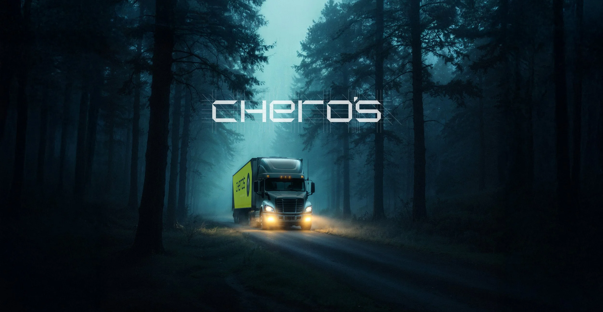
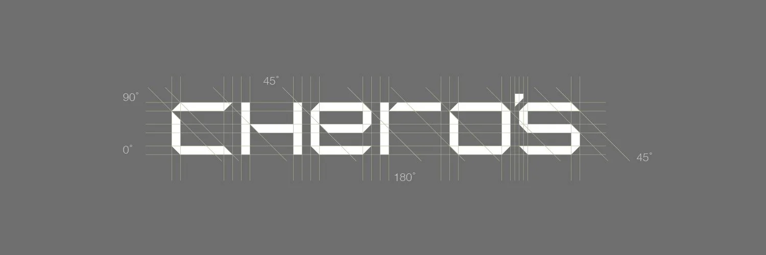
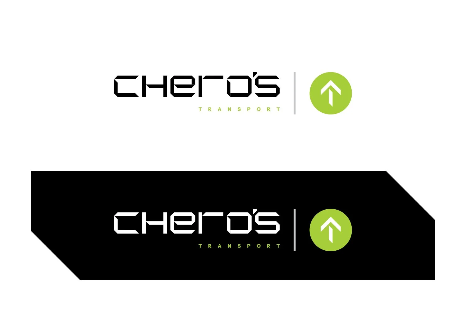
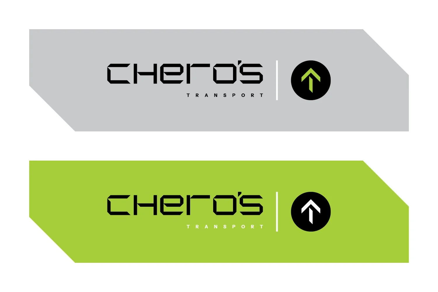
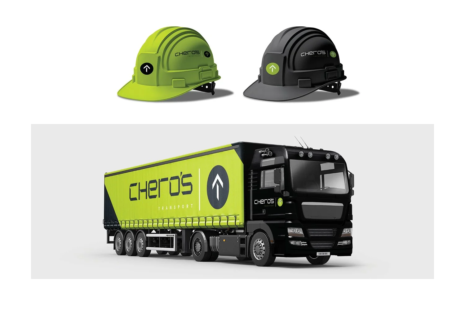
The new Chero’s Transport branding features a hand-drawn, geometric wordmark in black set on a bold lime-green panel for maximum visibility on the road. A simple black circle with a white upward arrow sits beside it, symbolising direction, progress and loads moving safely from A to B. Applied across the truck, the strong green-and-black livery turns each vehicle into a clean, modern moving billboard.
Chero’s Transport is a mid-size civil works and haulage company that moves materials safely, efficiently and on time. They operate a modern fleet of trucks and earthmoving equipment, servicing construction, infrastructure and industrial projects across the region. Every job is planned carefully – from loading and route selection to onsite coordination – to minimise downtime and keep projects moving.
Safety, reliability and clear communication with clients sit at the heart of how Chero’s runs its day-to-day operations.
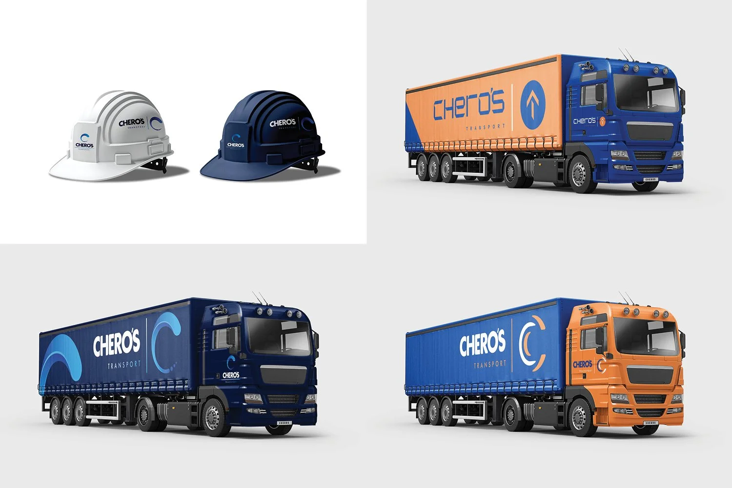
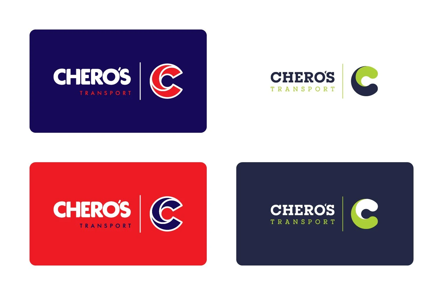
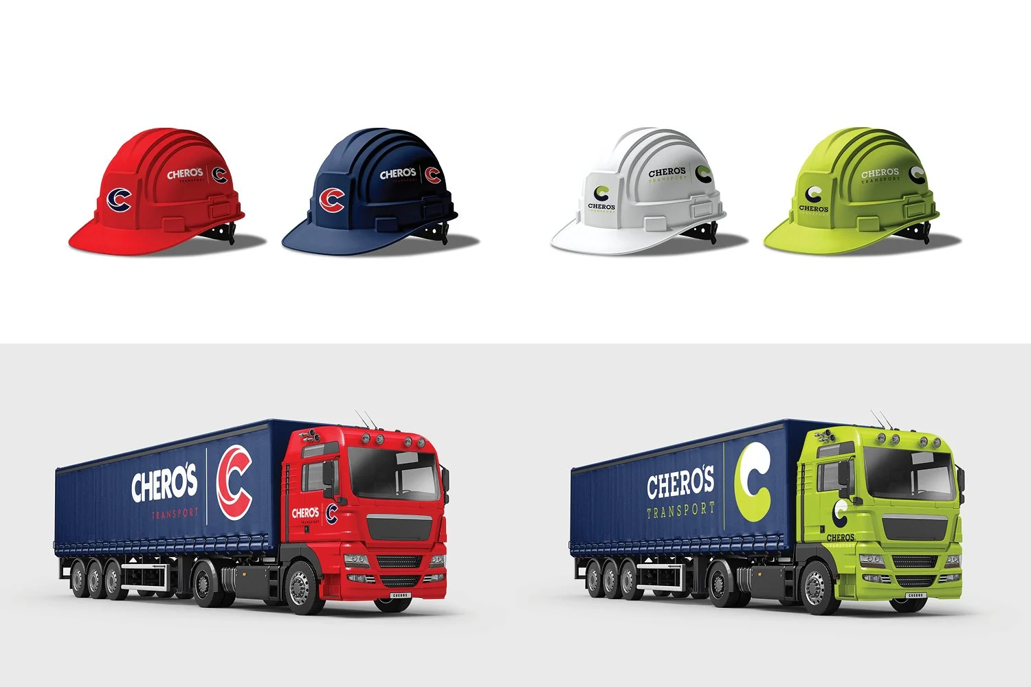
Before we landed on the final identity, we explored a range of alternative directions – from fluid, wave-inspired blues to high-impact red/navy and fresh lime/charcoal combinations. Each option kept the strong “C” symbol and bold CHERO’s wordmark, tested across helmets and full-truck liveries to check visibility, legibility and presence on the road. These routes all worked well in their own right, but ultimately helped confirm that the chosen brand best captures Chero’s reliability, professionalism and approachable nature. >>>
